SwiftUI Tips: Synchronizing Dimensions Between Two SwiftUI Views
Getting multiple views to perfectly match in size in SwiftUI might seem simple at first, but it can quickly turn into a head-scratcher. Let’s break it down with a straightforward UI example!
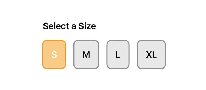
Here’s a size selection view that lets users pick a size, with buttons arranged horizontally for a clean and intuitive design.

Here’s what the code looks like:
enum Size: String, CaseIterable {
case small = "S"
case medium = "M"
case large = "L"
case extraLarge = "XL"
}
struct SizeSelectionView: View {
@State private var selectedSize: Size? = .small
var body: some View {
VStack(alignment: .leading) {
Text("Select a Size")
.font(.headline)
.padding(.bottom, 8)
HStack(spacing: 16) {
ForEach(Size.allCases, id: \.self) { size in
Button(action: {
print("Selected \(size)")
selectedSize = size
}) {
Text(size.rawValue)
}
.buttonStyle(
SizeButtonStyle(
isSelected: size == selectedSize
)
)
}
}
}
}
}
You’ll notice we’re using the buttonStyle modifier to apply a custom button style, making it easier to reuse across different parts of the app.
struct SizeButtonStyle: ButtonStyle {
let isSelected: Bool
var width: CGFloat?
func makeBody(configuration: Configuration) -> some View {
configuration.label
.font(.headline)
.padding()
.frame(width: width)
.background(
isSelected ? Color.orange.opacity(0.5) : Color.gray.opacity(0.2)
)
.foregroundColor(
isSelected ? Color.white : Color.black
)
.cornerRadius(8)
.overlay(
RoundedRectangle(cornerRadius: 8)
.stroke(
isSelected ? Color.orange : Color.gray,
lineWidth: 2
)
)
.scaleEffect(configuration.isPressed ? 0.95 : 1.0)
}
}
The UI looks great so far, but there’s something a bit off — the “XL” button is slightly larger than the others because it has two letters. Down the line, we might have buttons like “XXL” with three letters or even more. To ensure a consistent and polished design, we want to synchronize the size of all the buttons for a better user experience.
Using Explicit SizesPermalink
One possible solution is to set a fixed width for our buttons to ensure they all have a consistent size, like this:
...
.buttonStyle(
SizeButtonStyle(
isSelected: size == selectedSize
width: 60 // set the size directly here
)
)
...
While this works, it’s not an ideal long-term fix. Hardcoding the width means we might need to revisit this value later if we add buttons with longer titles or decide to change the text. It’s not the most flexible solution.
GeometryReaderPermalink
The most reliable way to tackle this issue is to sync the widths of all the buttons, ensuring they all use the same width - the maximum width among them. To achieve this, we can use GeometryReader, which gives us access to geometry details within the rendering context of our buttons.
Here’s what the implementation looks like. We’ve created a custom modifier to manage this logic, keeping reusability in mind:
struct SizeReader: ViewModifier {
let onChange: (CGSize) -> Void
func body(content: Content) -> some View {
content
.background(
GeometryReader { geometry in
Color.clear
.onAppear {
onChange(geometry.size)
}
.onChange(of: geometry.size) { _, newValue in
onChange(newValue)
}
}
)
}
}
The GeometryReader in this code acts as a layout container that provides access to the size of the view it’s measuring. Inside the GeometryReader, a Color.clear view is used as an invisible placeholder to trigger lifecycle events.
The onAppear and onChange modifiers are attached to the Color.clear view to report the size (geometry.size) when it first appears and whenever it changes. This setup allows capturing and responding to dynamic size updates of the parent view.
To make it even more convenient to use it in our views, we’ll add the modifier to a View extension.
extension View {
func readSize(onChange: @escaping (CGSize) -> Void) -> some View {
modifier(SizeReader(onChange: onChange))
}
}
Now, let’s revisit our size selection view and update it to use the new modifier.
struct SizeSelectionView: View {
...
@State private var buttonWidth: CGFloat?
var body: some View {
...
Button(action: {
print("Selected \(size)")
selectedSize = size
}) {
Text(size.rawValue)
}
.readSize { size in
buttonWidth = max(buttonWidth ?? 0, size.width)
}
.buttonStyle(
SizeButtonStyle(
isSelected: size == selectedSize,
width: buttonWidth
)
)
...
}
}
Here’s what we’ve done:
- Added a
buttonWidthstate. This stores the maximum with among all the buttons. - Applied a
readSizemodifier: we added this modifer to each button, which uses a closure to determine and capture the maximum size of our buttons. - Passed the
buttonWidthtoSizeButtonStyleto ensure all buttons are synchronized in size.
Now, if you check the preview, you’ll see that all the buttons are perfectly synced to have the same width.
ConclusionPermalink
Getting consistent button sizes doesn’t have to be a hassle. By using GeometryReader and a custom modifier, we created a simple, reusable solution to sync button widths dynamically. Now your SwiftUI designs can stay clean and adaptable with ease!
Thanks for reading!
Like what you're reading?
If this article hit the spot, why not subscribe to the weekly newsletter?
Every weekend, you'll get a short and sweet summary of the latest posts and tips—free and easy, no strings
attached!
You can unsubscribe anytime.